TL;DR: Quick Summary
A design that looks perfect on a backlit screen can fail on paper, thread and fabric. Cap embroidery can distort over seams, business card sizes differ by country (the standard business card size in Kenya is 85 × 55 mm), t-shirt graphics can land in the wrong spot, and RGB colours can turn dull in print. This guide covers 10 rules to check before you send files to the printer, so a print run in Kenya doesn’t end up as expensive waste. Need artwork prepared for production? See Studio6’s branding and print design services.
You spent weeks refining your logo on a bright monitor. The colours pop, the type is crisp, and the tagline is readable at 200% zoom. Then the delivery box arrives from the print shop: the cap embroidery is warped across the middle, the t-shirt graphic sits awkwardly on the stomach, and the colours look flat.
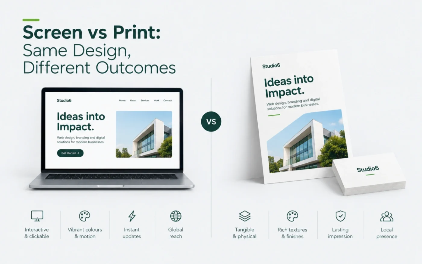
What happened? Screens emit light through pixels, while print uses physical ink, thread and fabric. They behave differently, and most costly print mistakes come from designing for one and producing on the other. Whether you print in Nairobi, Mombasa or anywhere else in Kenya, here are 10 rules to check before you approve any print or merchandise job.
1. Don’t Put Small Text or Fine Detail Across Cap Seams
Many structured caps are made from six panels, which means a raised seam runs straight down the middle of the front crown. (Five-panel caps have a single front panel and no centre seam, but they come with their own limits on shape and stiffness.)
- The problem: small lettering, thin lines and fine taglines get lost or distorted when embroidered or heat-pressed over that raised seam. Thread tension pulls differently on the seam than on flat fabric.
- The fix: keep caps to your boldest mark: the icon or a simplified logo. Save slogans and small text for flat items like letterheads, and ask your embroiderer for their minimum text height. Many recommend lettering of roughly 5 mm or taller on flat fabric, and caps often need larger.
- Also remember: embroidery isn’t printed from your logo file. A digitizer converts your artwork into a stitch file, so a simple, clean vector logo gives the best result.
2. Standard Business Card Size in Kenya: 85 × 55 mm
The standard business card size in Kenya is 85 × 55 mm (3.35 × 2.17 in). Business card sizes do vary by region, though, and printers set up their machines around the sizes they use most. Here is how the Kenyan standard compares with other common sizes:
| Standard / region | Millimetres | Inches | Character |
|---|---|---|---|
| US and Canada | 88.9 × 50.8 mm | 3.5 × 2.0 in | Wider and shorter; a long, slim shape |
| Kenya, Europe and UK | 85 × 55 mm | 3.35 × 2.17 in | Credit card proportions; a little taller |
| Australia and some other markets | 90 × 55 mm | 3.54 × 2.17 in | Slightly wider than the European size |
| Japan | 91 × 55 mm | 3.58 × 2.17 in | A little wider, with room for detail |
The standard business card size in Kenya is 85 × 55 mm, and it’s the size we use at Studio6 unless a client specifies otherwise. Some printers cut other sizes, so confirm the finished size with your printer before you start designing. Then set up your file at that size plus a 3 mm bleed on every side (91 × 61 mm for a standard Kenyan business card), so the edges don’t show accidental white slivers after trimming.
3. T-Shirt Placement Is Based on the Body, Not the Fabric
On a flat digital canvas, centring a graphic between the collar and the hem looks right. On a person, it lands on the stomach. Placement should be measured from fixed points: the collar seam, and the high point of the shoulder (where the shoulder seam meets the collar).
| Placement | Where it sits | Typical width |
|---|---|---|
| Left chest | About 7 to 9 cm (3 in) below the high point of the shoulder, offset toward the wearer’s left (roughly 10 cm from the centre line), never lower than the armpit | About 9 to 10 cm (3.5 to 4 in) |
| Full front | Centred, with the top edge roughly 7 to 10 cm (3 to 4 in) below the collar | About 25 to 30 cm (10 to 12 in) |
| Upper back | Centred, about 10 cm (4 in) below the back collar seam, across the shoulder blades | About 20 to 30 cm (8 to 12 in) |
These are common guidelines for adult sizes, and they shift for youth, women’s cuts and very small or large sizes. Always ask for a mockup showing the placement on the actual garment.
4. RGB vs CMYK: Why Colours Change in Print
Screens create colour by emitting RGB (red, green, blue) light, which can produce vivid neon pinks and electric blues. Presses mix physical CMYK (cyan, magenta, yellow, black) inks, which can’t reproduce some of those glowing colours. When an RGB file is converted for print, bright colours can look duller.
- For paper and card: ask your printer which colour mode and profile they want. Offset printers usually need CMYK, while many digital and large-format printers accept RGB and convert it themselves. Either way, check a proof before approving.
- For exact brand colours: specify Pantone (PMS) spot colours where your printer supports them.
- For embroidery and screen printing: colours come from thread charts and ink mixes, not CMYK, so give your supplier the Pantone references.
Keep the CMYK, Pantone and RGB values together in one brand sheet so every supplier matches the same colours.
5. Resolution: Images Need Enough Pixels for the Printed Size
Web and WhatsApp images are small and compressed so they load quickly. Stretched across a printed banner or card, they look blurry and pixelated. The key number isn’t the “72 DPI” label in the file, it’s how many pixels the image has at the printed size. PPI (pixels per inch) describes your image, while DPI (dots per inch) describes how finely a printer lays down ink dots, and the two are often confused.
For most print work, aim for 300 pixels per inch at the final size. A standard Kenyan business card with bleed is 3.58 inches wide (85 mm plus 3 mm bleed on each side), so it needs about 1,075 pixels across, while a 12-inch t-shirt print needs about 3,600. Large banners viewed from a distance can often use less, so ask your printer for the minimum.
6. Vector vs Raster: The Scalability Trap
PNG and JPEG files are raster images made of a fixed grid of pixels, so they blur when enlarged. Vector files (AI, EPS, SVG or vector PDF) store shapes as maths, so they scale from a business card to a billboard without losing sharpness. Vectors are also the best starting point for embroidery digitizing, screen printing and signage. Keep your master logo as a vector and supply raster versions only for web use.
7. Thin Lines and Fine Fonts Disappear: Allow for Ink and Thread
On paper and fabric, ink spreads slightly into the fibres (known as dot gain). Hairline fonts and very thin lines that look crisp on screen can fill in or vanish in print. Use medium-to-bold weights for small text. Screen printing and embroidery need even more generous line weights than offset printing, so ask your supplier for their minimum line thickness before you finalise the design.
8. Paper Stock Changes How Your Design Looks
The same artwork looks different on different stock. Uncoated, textured or kraft paper absorbs ink, which softens colour and contrast. Coated gloss or matte stocks hold ink closer to the surface for sharper edges and deeper blacks. Choose the stock first, then check that your colours and fine details still work on it.
9. Respect the Safe Zone and Cutting Tolerance
Industrial cutters trim stacks of cards at once, and the cut can shift by a millimetre or two. A logo or phone number sitting too close to the edge can be sliced off or look uneven. Keep all important text and logos inside a safe margin of 3 mm from the trim line (or whatever your printer specifies, as some ask for up to 5 mm), and let background colours or images extend into the bleed.
10. Always Request a Physical Proof
A PDF proof on your screen can’t show paper texture, ink absorption or thread thickness. Before approving a large run of cards, caps or shirts, ask your Kenyan printer or embroiderer for a physical sample or a first-piece sample. It usually costs a small fraction of the full run, and it’s far cheaper than reprinting.
Want your artwork production-ready? We prepare vector logos, colour specifications and print-ready files for cards, caps, shirts and signage. See our branding services.
Quick Pre-Print Checklist
- Logo supplied as a vector (AI, EPS, SVG or vector PDF).
- Finished size confirmed with the printer (85 × 55 mm for a standard Kenyan business card), with 3 mm bleed and a safe margin of 3 mm or the printer’s stated requirement.
- Colour mode confirmed with the printer, with CMYK and Pantone values specified and suppliers using the same values.
- Images at about 300 pixels per inch at the final printed size.
- No small text or fine lines over cap seams, and lettering above the supplier’s minimum size.
- Garment placement checked on a mockup of the actual item.
- Physical proof or sample approved before the full run.
Frequently Asked Questions
What is the standard business card size in Kenya?
The standard business card size in Kenya is 85 × 55 mm (3.35 × 2.17 in), the same size used across Europe and the UK. The US and Canada use 88.9 × 50.8 mm (3.5 × 2 in). At Studio6 we use 85 × 55 mm unless a client specifies otherwise. Confirm the finished size with your printer, and add a 3 mm bleed when setting up your file, which makes the file 91 × 61 mm.
What is bleed in printing?
Bleed is extra artwork that extends beyond the final trim edge, typically 3 mm on each side. It makes sure backgrounds and images reach the edge of the card after cutting, without white margins.
Should I design in RGB or CMYK for print?
Ask your printer which colour mode they want. Offset printing usually needs CMYK or Pantone spot colours, while many digital printers accept RGB and convert it themselves. RGB colours can look duller after conversion, so check a proof. For embroidery and screen printing, give your supplier Pantone references, since thread and ink colours are matched differently.
What resolution do I need for print?
Aim for about 300 pixels per inch at the final printed size. Large banners viewed from a distance can often use lower resolution, so ask your printer for their minimum.
Why does my logo look different when embroidered?
Embroidery converts your artwork into stitches, so fine details, thin lines and small text can get lost. Simple, bold logos in vector format digitize best, and a seam on the cap can distort detail further.
Do I really need a physical proof?
Yes, for any large or expensive run. A screen proof can’t show paper texture, ink absorption or thread thickness, and a physical sample usually costs far less than reprinting a full batch.
How Studio6 Can Help
At Studio6, we bridge the gap between digital identity and physical production. We create visual identity systems, vector brand assets and clear print specifications so your brand looks right on screens, paper and apparel.
Ready to get your physical branding right? Explore our branding services, or tell us about your project at hello@bystudio6.com.